Some simulation results are shown with the same input as in the initial notebook with the only difference is the change in the spacer height and the cell size. The first simulation was done with a really “big” spacer of 2 nm; however for a system Co-Ru-Co the value for the RKKY coefficient doesnt correspond to the value of the spacer used:
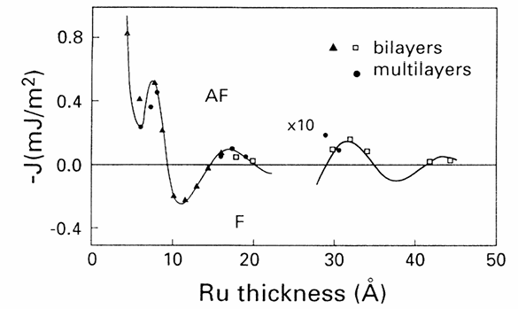
Figure 1:Coupling coefficient for Co/Ru/Co layers from Bloemen et al. (1994)
According to Bloemen et al. (1994) the value for the RKKY coefficient corresponding to should be for an spacer of around 0.8 nm, so this results are shown for an spacer of height 0.8 nm and cell size of 3x3x0.2 nm
The following script was used to create the images shown at the bottom of the notebook for the results of the simulation.
1 2 3 4 5 6 7 8 9 10 11 12 13 14 15 16 17 18 19 20 21 22 23 24 25 26 27 28 29from results_analysis import find_omf_file, visualize_field RESULTS_PATH = "../results/saf_skyrmion-0.8nm" IMAGES_PATH = "../images/saf_skyrmion-0.8nm-z_0.8nm-results" def create_plots(): Ds = range(150, 825, 75) Mss = range(260, 460, 20) system_name = 'saf_skyrmion' for D in Ds: for Ms in Mss: dirname = f'saf_skyrmion-{D}nm-{Ms}kA_m' drive_path = f"{RESULTS_PATH}/{dirname}/{system_name}/drive-0/" try: omf_file_path = find_omf_file(drive_path) except: print(f'Didnt found file for D,Ms = {D},{Ms}') continue visualize_field( f"{drive_path}/{omf_file_path}", D=D, Ms=Ms, images_path=IMAGES_PATH ) if __name__ == '__main__': create_plots()
The source code can be checked at the repo for scripts. The following cells show the topological phases obtained from the simulation. For visualization, one just has to click the button to use the binder server linked to this repo and use interactively this notebook.
from IPython.display import display, Image

import ipywidgets as widgets
import os
Ds = range(150, 825, 75)
Mss = range(260, 460, 20)
image_options = {}
for D in Ds:
for Ms in Mss:
label = f'D={D} nm and Ms={Ms} kA/m'
image_name = f'skyrmion-{D}nm-{Ms}kA_m.png'
image_t_name = f'skyrmion-{D}nm-{Ms}kA_m-tranversal.png'
image_options[label] = [image_name, image_t_name]
image_folder = "../images/saf_skyrmion-0.8nm-z_0.8nm-results"
def show_image_pair(option):
image_files = image_options[option]
for img_file in image_files:
img_path = os.path.join(image_folder, img_file)
display(Image(img_path, width=800))
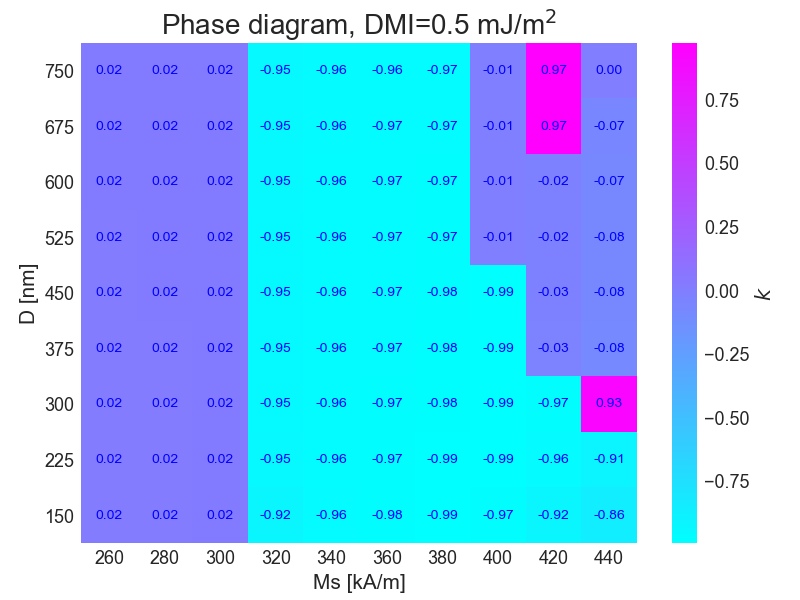
widgets.interact(show_image_pair, option=list(image_options.keys()))<function __main__.show_image_pair(option)>For this simulation the phase diagram was plotted according to the topological constant for each field
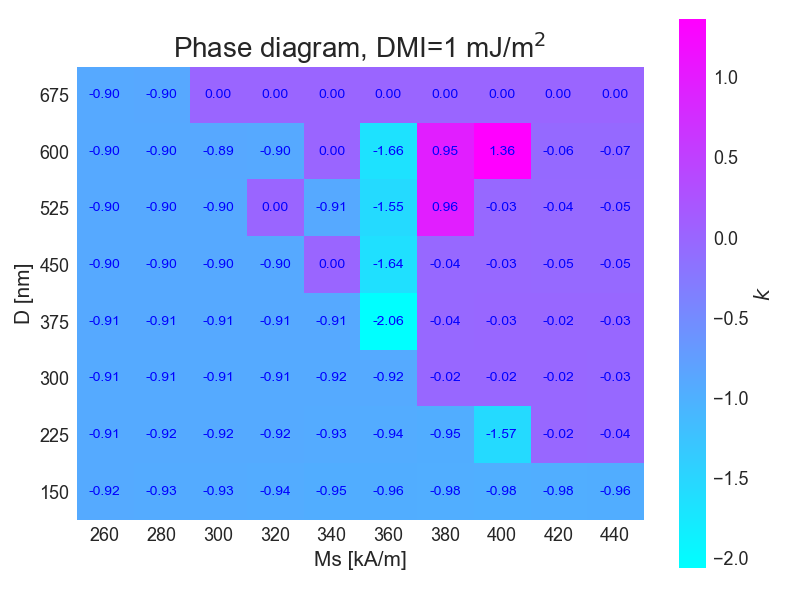
Then the simulations were repeteaded, but now the value for DMI interaction was set to J/m
Ds = range(150, 750, 75)
Mss = range(260, 460, 20)

image_options = {}
for D in Ds:
    for Ms in Mss:
        label = f'D={D} nm,  Ms={Ms} kA/m'
        image_name = f'skyrmion-{D}nm-{Ms}kA_m.png'
        image_t_name = f'skyrmion-{D}nm-{Ms}kA_m-tranversal.png'

        image_options[label] = [image_name, image_t_name]

image_folder = "../images/saf_skyrmion-0.8nm-z_0.8nm-d_1-results"

def show_image_pair(option):
    image_files = image_options[option]
    for img_file in image_files:
        img_path = os.path.join(image_folder, img_file)
        try:
            display(Image(img_path, width=800))
        except:
            print('404')

widgets.interact(show_image_pair, option=list(image_options.keys()))<function __main__.show_image_pair(option)>For this simulation the phase diagram was plotted according to the topological constant for each field
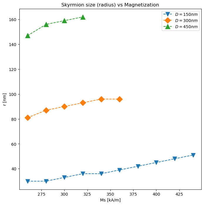
We can plot the skyrmion size differences too for two
radii_150nm = {
    260: 30,
    280: 30,
    300: 33,
    320: 36,
    340: 36,
    360: 39,
    380: 42,
    400: 45,
    420: 48,
    440: 51
}

radii_300nm = {
    260: 81,
    280: 87,
    300: 90,
    320: 93,
    340: 96,
    360: 96
}
radii_450nm = {
    260: 147,
    280: 156,
    300: 159,
    320: 162
}
import matplotlib.pyplot as plt
magnetisation_values = range(260, 380, 20)
fig, ax = plt.subplots(figsize=(8,8))
ax.plot(radii_150nm.keys(), radii_150nm.values(), marker='v', ls='--', label=r'$D=150nm$', ms=10)
ax.plot(radii_300nm.keys(), radii_300nm.values(), marker='D', ls='--', label=r'$D=300nm$', ms=10)
ax.plot(radii_450nm.keys(), radii_450nm.values(), marker='^', ls='--', label=r'$D=450nm$', ms=12)
ax.set_xlabel('Ms [kA/m]')
ax.set_ylabel('r [nm]')
ax.set_title('Skyrmion size (radius) vs Magnetization')
ax.legend()
import micromagneticdata as md
fig, ax = plt.subplots(figsize=(8,8))

options = {
    300: {
        'marker': 's',
        'color': 'r'
    },
    450: {
        'marker': 'D',
        'color': 'g'
    }
}

for D in [300, 450]:
    total_energy = {}
    for Ms in range(260, 460, 20):
        data = md.Data(name='saf_skyrmion', dirname=f'../results/saf_skyrmion-0.8nm/saf_skyrmion-{D}nm-{Ms}kA_m')
        total_energy[Ms] = data[0].table.data.E
    ax.plot(total_energy.keys(), total_energy.values(), marker=options[D]['marker'], c=options[D]['color'], ls='--', label=rf'$D={D}nm$', ms=10)

ax.set_xlabel('Ms [kA/m]')
ax.set_ylabel('E [J]')
ax.set_title('Relaxation Energy vs Magnetization')
ax.legend()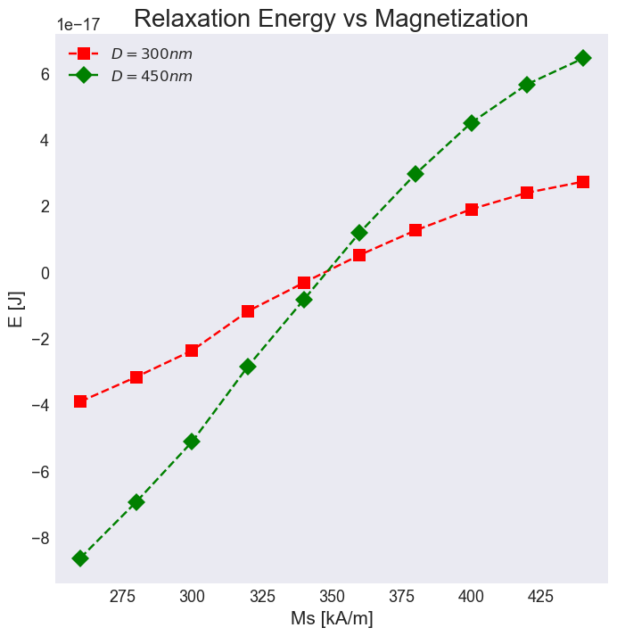
data[0].table.data.columnsIndex(['max_mxHxm', 'E', 'delta_E', 'bracket_count', 'line_min_count',
'conjugate_cycle_count', 'cycle_count', 'cycle_sub_count',
'energy_calc_count', 'E_exchange', 'max_spin_ang_exchange',
'stage_max_spin_ang_exchange', 'run_max_spin_ang_exchange', 'E_rkky',
'E_uniaxialanisotropy', 'E_demag', 'DMI_Cnv_z:dmi:Energy', 'iteration',
'stage_iteration', 'stage', 'mx', 'my', 'mz'],
dtype='object')- Bloemen, P. J. H., van Kesteren, H. W., Swagten, H. J. M., & de Jonge, W. J. M. (1994). Oscillatory interlayer exchange coupling in Co/Ru multilayers and bilayers. Physical Review B, 50(18), 13505–13514. 10.1103/physrevb.50.13505
- Bloemen, P. J. H., van Kesteren, H. W., Swagten, H. J. M., & de Jonge, W. J. M. (1994). Oscillatory interlayer exchange coupling in Co/Ru multilayers and bilayers. Physical Review B, 50(18), 13505–13514. 10.1103/physrevb.50.13505